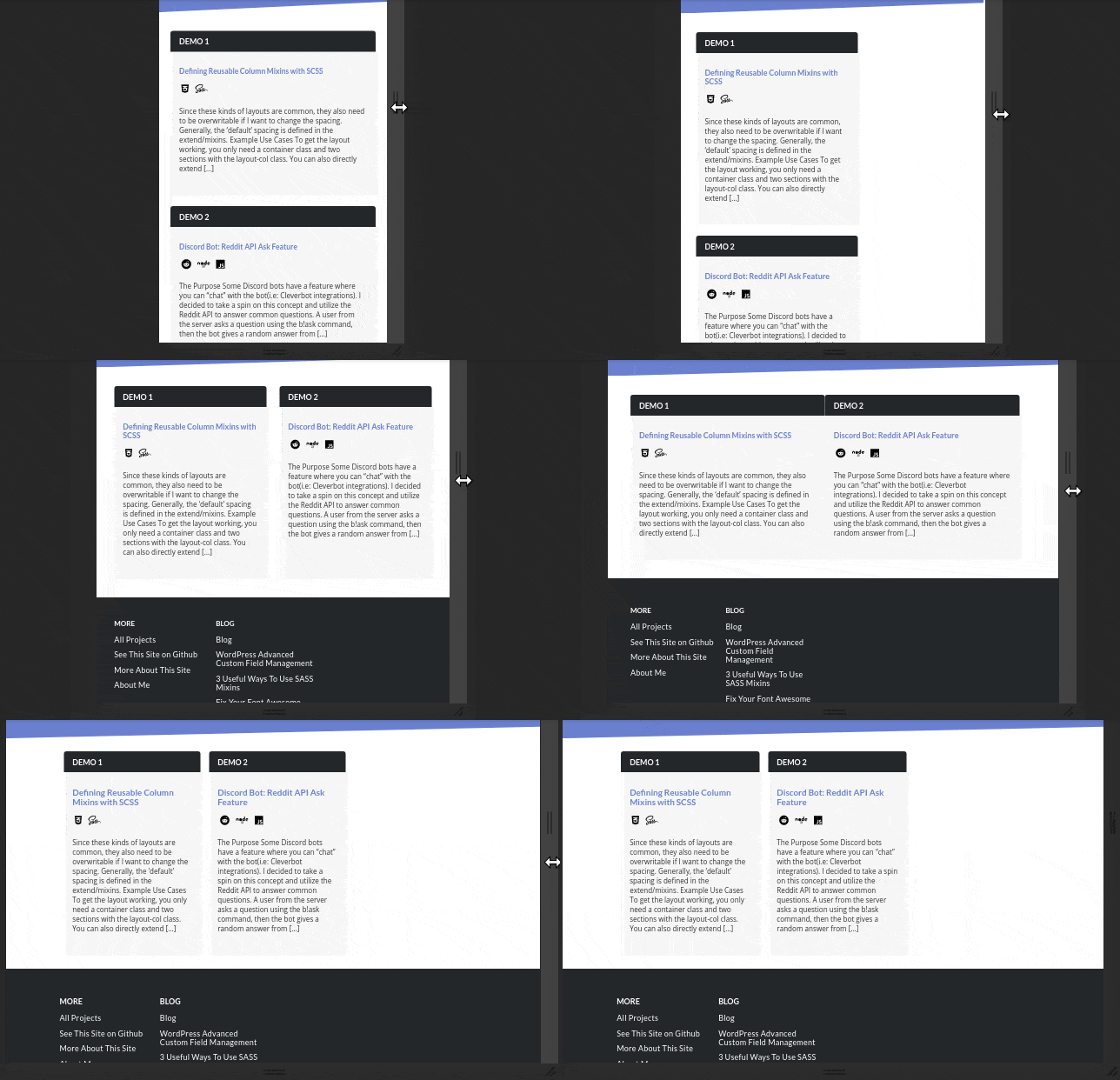
Using SCSS, creating flexible layouts that are reusable across projects is a breeze.

// Half columns that break into their own row on mobile screens
%layout-two-columns {
    display: flex;
    flex-wrap: wrap;
    justify-content: space-between;

    .layout-col {
        flex-basis: 48%;
        max-width: 48%;
        margin: 25px 0;

        @include atMobile {
            flex-basis: 100%;
            max-width: 100%;
        }
    }
}

// Four columns that stack next to each other on desktop screens,
// break into half columns on medium & tablet sizes, then break
// into their own row like the half columns above
%layout-four-columns {
    display: flex;
    flex-wrap: wrap;
    justify-content: space-between;

    .layout-col {
        flex-basis: 24%;
        max-width: 24%;

        @include atMobilePlus {
            flex-basis: 48%;
            max-width: 48%;
            margin: 12.5px 0;
        }

        @include atMobile {
            flex-basis: 100%;
            max-width: 100%;
        }
    }
}
The atSmall type mixins are just basic media queries.
Since these kinds of layouts are common, they also need to be overwritable if I want to change the spacing. Generally, the ‘default’ spacing is defined in the extend/mixins.
Example Use Cases
<div class="layout-two-cols">
    <div class="layout-col">
        <!-- content -->
    </div>
    <div class="layout-col">
        <!-- content -->
    </div>
</div>
You can think of them like pre-defined Bootstrap columns. To get the layout working, you only need a container class and two sections with the layout-col class.
You can also directly extend it inside a .scss
.layout-two-col {
    @extend %layout-two-cols;
}


Comments