Disclaimer
This post was written a few years ago using a React version that is several versions back. This code is untested on newer versions.
Modals are a classic piece of application functionality, made even easier with libraries like React. You could go with a library, but you can often make your own with less than 100 lines of code. Using the hooks API, you don’t even need a class-based approach. This example is going full functional!
Defining The Functionality
Modals usually have a few key pieces of functionality. The ability to close it, and a “slot” of content to pass into it, such as multiple paragraphs, buttons, and other design elements. This example will use props so we can configure our modal to take any amount of content, and optionally define a close button.
The Full Source
import React, { useState } from 'react';
import { checkVisitCount } from '../../helpers/store/general';

const Modal = props => {
    const [toggled, setToggled] = useState(true);

    function toggleModal() {
        setToggled(false);
    }
    function renderButton() {
        if(props.showButton) {
            return (
                <div className="button-container mt-small">
                    <button onClick={toggleModal} className="button">
                        {props.buttonText}
                    </button>
                </div>
            );
        }
        else return null;
    }
    function renderCloseButton() {
        if(props.showClose) {
            return (
                <i onClick={toggleModal}
                   className="far fa-times-circle close">
                </i>
            )
        }
        else return null;
    }
    function isModalHidden() {
        return toggled && props.closedFromOuter ? '' : 'hidden ';
    }

    if(checkVisitCount() === 1 || !props.firstVisitOnly) {
        return (
            <section className={`modal column-center mobile-fixed ${isModalHidden()}`}>
                <div className="inner-container">
                    <div className="head">
                        {renderCloseButton()}
                    </div>
                    <div className="content">
                        {props.children}
                    </div>
                    {renderButton()}
                </div>
            </section>
        );
    }
    else return null;
}

export default Modal;
This is a good amount of code, so I will break it down step by step. The key pieces are the props.children
Rendering the Icons and Button
const [toggled, setToggled] = useState(true);
function toggleModal() {
    setToggled(false);
}
function renderButton() {
    if(props.showButton) {
        return (
            <div className="button-container mt-small">
                <button onClick={toggleModal} className="button">
                    {props.buttonText}
                </button>
            </div>
        );
    }
    else return null;
}
Notice the toggleModal function. This is the equivalent of calling setState, it’s simply modifying the component state. props.showButtonbuttonText prop for content.
function renderCloseButton() {
    if(props.showClose) {
        return (
            <i onClick={toggleModal}
               className="far fa-times-circle close">
            </i>
        )
    }
    else return null;
}
This part works the same as the button. The only difference is that it renders on the top as an ‘x’ icon. Other than that, it will toggle the modal on click and can optionally not render based on the showClose prop.
if(checkVisitCount() === 1 || !props.firstVisitOnly) {
    return (
        <section className={`modal column-center mobile-fixed ${isModalHidden()}`}>
            <div className="inner-container">
                <div className="head">
                    {renderCloseButton()}
                </div>
                <div className="content">
                    {props.children}
                </div>
                {renderButton()}
            </div>
        </section>
    );
}
else return null;
//determine if the modal should show. It renders a hidden class so it can be animated with CSS easily

function isModalHidden() {
    return toggled && props.closedFromOuter ? '' : 'hidden ';
}
Here is the main “skeleton” of the modal component. It calls the icon and button render classes, and determines if the modal should show up based on the props passed in. The visit functions are a separate part of the app that I may show in a future demo or tutorial. You can add your own logic in place of it if necessary.
In a nutshell, determine if props pass. If they do, render the modal, else return null. Get the class names and render the rest of the content by calling the other functions in the component.
Using the Component
Calling it is simple. You’d pass in the content like a slot, similar to something like Laravel blade or Vue.js. I’m comfortable with these, so I did it in React in the way that was most familiar to me. I found that props.children
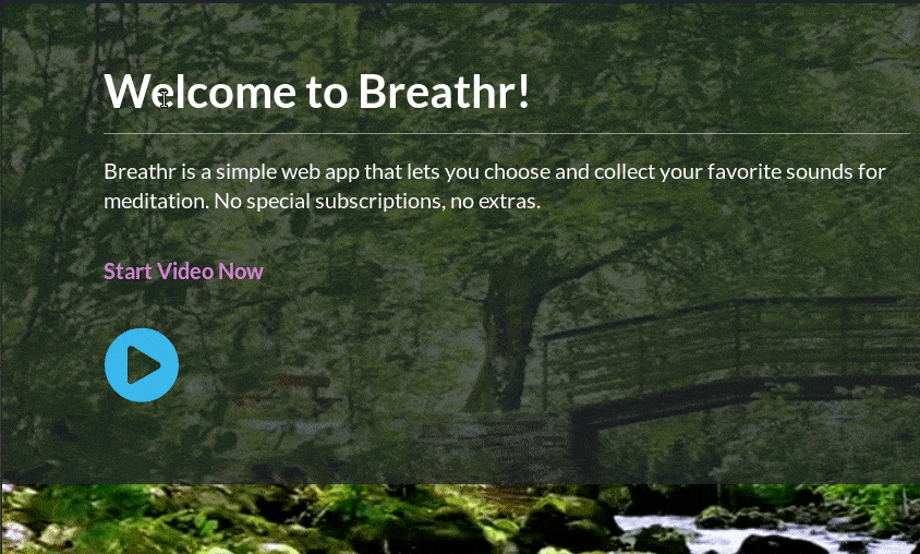
<Modal
    showButton={false}
    closedFromOuter={toggled}
    firstVisitOnly={false}>
    <div className="header-container bottom-line">
        <h2 className="title">Welcome to Breathr!</h2>
    </div>
    <p>This is a simple web app that lets you choose and collect your favorite sounds for meditation. You are on a <strong className="emphasize">mobile device</strong>, so you will need to click the play button below in order to get started with streaming videos. </p>

    {startVideoSection()}
</Modal>
Three props are being passed in, showButton, closedFromOuter, and firstVisitOnly. The values of these props will be based on the context of the modal you’re using it in. Creating and adding more prop logic to extend this should be simple.
For the modal’s content, we’re adding a header and paragraph with a ‘play’ button. The specific content that’s rendered here is not relevant to the example, so I won’t go too in depth.
Once you have these functionalities, extending and adding application specific logic shouldn’t be too difficult. Enjoy!


Comments