For years now, SASS has given CSS the functionalities that native CSS wish it could. These includes variables, selector nesting, mixins, extends, and much more. One simple but very powerful thing SASS gives you is the ability to outsource a similar set of style rules into a reusable “function”. This lets you centralize style logic to make your app/website more scalable.
In this part of the Getting Sassy series, I will give you some ideas for using mixins to save time, and mental bandwith when writing code. You may have already come up with some ideas on your own, but hopefully I can help push some more along.
How To Organize Mixins
Before we start, it might be helpful to know where or how to organize mixins. I avoid putting them in specific files because they end up getting lost in hundreds of .scss files. It’s smart to put them in their own top-level global file since these styles can potentially be applied to many different elements. Here’s an example of how I’d do it.
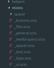
If you use mixins for buttons, put them in a file name that is easy to recognize under a global folder. The folder name “mixins” is easiest for me to recognize, but do whatever works for you. Generally, put groups of similar mixins in their own files, as you would for any other component.
Reusable Alignment Classes
One easy way to save some code is to outsource style classes that can be applied to any kind of generic element. A good example is flexbox, so we will be using that as an example.
If you want to center multiple divs down the center, you may use something like this
.some-div {
  display: flex;
  flex-direction: column;
  align-items: center;
}
This code will work and is only 3 lines, but can easily be used in multiple places. If you outsource it to a mixin, your code may look something like this.
//mixins/flex.scss
@mixin column-center() {
  display: flex;
  flex-direction: column;
  align-items: center;
}
.some-div {
  @include column-center;
}
Now we can include these 3 lines of code from anywhere in our app. There are two major benefits besides saving code.
For one, the name ‘column-center’ describes exactly what is happening, which can’t be said for the flex-direction and align-items. Often times, it’s easy to get the specific flexbox axis rules mixed around, so a clear alias that you name is more clear.
Two, if you want to change how the multiple elements this mixin is applied to works, you can do it in one central place. For example, if you want to offset centered elements, you can do it in one mixin instead of hunting down all of the smaller files.
There are plenty more alignment helpers you can make. Right align, left align, 50-50 columns, and so on. They can be as simple or as complex as you want them to be.
Media Queries
The second method here is one of my favorites. Media queries. We all write them, and they are completely necessary in modern development. I will cover it briefly here, but do go in depth in this post.
The basic idea is to outsource common media queries using the @content block. The content block let’s you pass content into your query in a way you’d pass content into a prop’s <slot> component in something like Vue or React. If you’re not familiar with this concept, just look at the example below.
@mixin atMobile() {
  @media screen and (max-width: $mobile) {
    @content;
  }
}
As you can see, we have a normal media query that applies at my $mobile breakpoint. $mobile in this example would be defined somewhere as a variable, such as 700px. Instead of writing that media query, we simply include our mixin and pass the content.
.paragraph {
  @include atMobile {
    //this is the 'block' we pass into the media query.
    //just normal CSS styles
    text-align: center;
    color: $grey;
  }
}
This is a fairly simple media query, but atMobile is much easier to type and understand than typing the actual media query. I have these set up for 5-6 breakpoints with min and max values. Here are some more ideas:
// Apply to screens bigger than the $tablet breakpoint, instead of smaller
@mixin atTabletUp() {
  @media screen and (min-width: $tablet) {
    @content;
  }
}
//a bit rare, but useful in some cases
@mixin atMobileOnly() {
  @media screen and (max-width: $mobile) and (min-width: $tiny) {
    @content;
  }
}
// grr...
@mixin ifIE() {
  @media all and (-ms-high-contrast: none), (-ms-high-contrast: active) {
    @content;
  }
}
Now when you use media queries, you only need to memorize names for each breakpoint. Definitely one of my most used mixins.
Spacing Helpers
Obviously, a web app or page will have tons of spacing rules. White space, columns, and layouts all need spacing. It makes sense to outsource some of the logic. How can we start? Think about how you use spacing. Each little component on your page likely has top and bottom padding. Some of their inner sections need either a small, medium, or large amount of margin between them.
For starters, I like to keep all spacing between elements as simple as possible. Here’s an example mixin I use to accomplish this.
@mixin spacer() {
  padding: $spacer-medium-plus 0;

  @include atTablet() {
    padding: $spacer-medium 0;
  }
}
Here, we are adding a medium amount of padding on the top and bottom of the applied element. When it hits the tablet breakpoint, it adds a different(less) amount of padding. For example, it could apply 65px at larger screens, and something like 45px on smaller screens. You have control over what values are applied at what breakpoints, which works great when website requirements change and you want to alter the overall spacing of the site.
To apply it to an element, do something like this.
.cta {
  @include spacer;
}
.cta {
  //define another mixin that adds more spacing than usual
  @include spacer-larger;
}
This gives us consistency across components, and the ability to change the spacing between multiple similar components by changing variables names. You can include a custom spacer too.
@mixin spacer-custom($large, $small) {
  padding: $large 0;

  @include atTablet() {
    padding: $small 0;
  }
}
//call it like this
.cta {
  @include spacer-custom(75px, 35px);
}
Neat, huh? I find this useful because I don’t have to use as many media queries in specific files, that logic is outsourced to the mixins. You can make this outsourced logic as specific as you want, but I like to keep it general. The same can be applied to a right and/or left margin.
//apply margin left at these breakpoints
@mixin ml-custom($large, $small) {
  margin-left: $large;

  @include atTablet {
    margin-left: $small;
  }
}
//top margin, with an extra breakpoint
@mixin mt-custom-full($large, $medium, $small) {
  margin-top: $large;

  @include atTablet {
    margin-top: $medium;
  }

  @include atSmall {
    margin-top: $small;
  }
}
Conclusion
As you can see, there are quite a few pieces of reusable logic that can be outsourced. When using these kinds of mixins up to 10.. or even 50 times, it can save lots of time and code. There are plenty more ways you can use mixins to accomplish this, but hopefully these get the ideas rolling. That’s about it for this post, if you enjoyed it and think someone else can benefit from it, please share it! I’d really appreciate it 🙂
Posted on
It’s awesome to pay a quick visit this website and reading the views of all mates regarding this piece of writing, while I am also eager of getting familiarity.
More Posts
Using debounce in Vue.js templates
For years now, SASS has given CSS the functionalities that native CSS wish it could. These includes variables, selector nesting, mixins, extends, and much more. One simple but very powerful thing SASS gives you is the ability to outsource a similar set of style rules into a reusable “function”. This lets you centralize style logic…
Read More
Let’s Learn Laravel Blade: Components (Part 4)
For years now, SASS has given CSS the functionalities that native CSS wish it could. These includes variables, selector nesting, mixins, extends, and much more. One simple but very powerful thing SASS gives you is the ability to outsource a similar set of style rules into a reusable “function”. This lets you centralize style logic…
Read More
Let’s Learn SASS & SCSS: Setting Up The Build (Part 2)
For years now, SASS has given CSS the functionalities that native CSS wish it could. These includes variables, selector nesting, mixins, extends, and much more. One simple but very powerful thing SASS gives you is the ability to outsource a similar set of style rules into a reusable “function”. This lets you centralize style logic…
Read More
Getting to Know JS: slice vs splice
For years now, SASS has given CSS the functionalities that native CSS wish it could. These includes variables, selector nesting, mixins, extends, and much more. One simple but very powerful thing SASS gives you is the ability to outsource a similar set of style rules into a reusable “function”. This lets you centralize style logic…
Read More
Make Your CSS Life Easier, Learn To Abstract Media Queries With SASS Mixins
For years now, SASS has given CSS the functionalities that native CSS wish it could. These includes variables, selector nesting, mixins, extends, and much more. One simple but very powerful thing SASS gives you is the ability to outsource a similar set of style rules into a reusable “function”. This lets you centralize style logic…
Read More
CSS Tip: Using a Nested Link to Fill an Entire Div
For years now, SASS has given CSS the functionalities that native CSS wish it could. These includes variables, selector nesting, mixins, extends, and much more. One simple but very powerful thing SASS gives you is the ability to outsource a similar set of style rules into a reusable “function”. This lets you centralize style logic…
Read More